Introduction
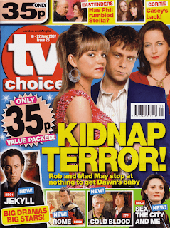
For my project, I was to create a TV soap trailer with two ancillary tasks to go along side the production. For these, I chose to create a poster and a front cover of a soap or TV listings magazine. For my project, I worked with two other members of my media group, Rob Maclean and James Laraway. My particular contributions to the projects were mainly to create the ancillary tasks, which I started to work on straight after our filming, which I was also a part of. I researched soap magazines in detail to be aware of the typical conventions, the structure, layout; designs etc of the magazines and then created our own TV listings magazine. I selected the relevant photographs, all close up shots in particular, as from my research I discovered these are traditional on magazine front covers as opposed to distant photographs. I then cut them out using Photoshop, to ensure they would look professional and then by selecting the colours carefully, and the layout my magazine should follow, was successful in my aim to create the front cover of a soap magazine that follows the conventions of traditional TV listings magazines which therefore allows the audience to be understanding of the genre. Our main target audience for the TV trailer using the demographic profiling of GRASS is mainly females, of any race, ages between 16-35 year olds. It will attract an audience around c1/c2 on the socio-economic scale and according to Young and Rubicans cross cultural consumer characteristics would be aimed at the mainstream audience, because our product is soap trailer and soaps are well known brand names and mainstream audiences tend to buy these brand names. Our product will appeal to this audience as from our research we carried out before deciding on our target audience, confirmed that it is mainly woman aged between 16-35 on average that tend to watch soap operas. Also, Abercrombie (1996:51) argues that “the soap world is a woman's world; dominated by the domestic scenes, the emotions and feelings of strong female characters with a strong sympathy for these feelings and problems. Men, it seems, are excluded from watching these programmes by their very nature.” This quote also suggested to us that our product would be more successful in being aimed at our specified target audience of women
Question One-Genre.
The genre of our project is a TV trailer for a soap opera. When creating our project, we made sure that we were aware of what particular elements we needed to follow to make the genre of our production clear to our audience. Following our research, it was clear to us that TV trailers do not follow the typical, expected conventions of soap operas themselves. Although Soap operas all follow typical conventions that enable the programme to be recognised clearly by audiences, the TV trailers that are used to promote a particular storyline in the programme often break the conventions that soap operas are usually confined and follow more of a film trailer format.
This trailer for Eastenders, was a perfect way to demonstrate that TV trailers do not follow the conventions that soap operas are usually confined. This trailer, follows more of a film trailer format. Some examples of typical elements that soap operas use are stereotypes, multi-stranded narratives, cliff hangers, time, realism of costumes and locations, important social issues are addressed and there are usually typical communal meeting places.
Although it was important for us to understand the generic conventions of soap operas, we still had to follow particularly for inspiration, and to make sure our final production was typical of this kind of product, the genre of film trailers. It was very important for us to clearly understand the genre of our production, so that audiences would be able to recognise and feel familiar with our product. Graeme Burton stated, “Genres are created through repetition and recognition leading to anticipation and expectation” (2000) this quote enables us to focus fully on making sure that the genre of our production focused on fulfilling our audiences expectations and following typical elements of the genre and repeating conventions so that the audience feel familiar with the product and that we do not frighten them away.
When creating our trailer, we understood it was vital to include the typical conventions that TV trailers include, but also to involve something different and something audiences are not used to seeing. Looking back at our audience feedback, our choices to add new and different elements, worked really effectively for our audience. They clearly took note of the different elements that we included that other soap trailers have not. For example, the split screen effect, showing both characters at the same time to help establish the storyline clearly, the rewinding of shots which we included for added interest and effect and the use of black and white shots incorporated into the coloured ones, along with the whole theme of the trailer being a poker scene, something that no other soap has considered creating. Eventually, our trailer became a hybrid, having more than one genre, the soap genre and also the gangster genre.
This poker scene from Lock, stock and two smoking barrels, really inspired us to create something different to promote our soap. We were inspired by the shots and use of colour grading. We included similar shots to make our audience clear of the genre that we were promoting.
I think our innovations were likely to prove successful as audiences are always keen to see something new and so for this reason, the new, different elements, which we added to our production, gave the audience something unique which was successful in grabbing their attention and having the strong impact in them wanting to see the trailer over and over again.
However we also understood that we couldn’t create our TV trailer too different from the conventional trailers as our audiences would reject it as it would not fulfill their expectations. To enable our audiences to feel familiar with our trailer, we did not include any speech, but instead music, which is typical of TV trailers. The music we selected, for our trailer, reflected more of the gangster genre with the old, dark and husky sound that it had to it. I feel that the selection of music went really well with the content of the trailer and the genre, enabling audiences to feel comfortable and be fulfiled of their expectations. I also understood for the creation of the ancillary tasks that it was as important to consider the genre, and the typical conventions of posters to TV listings magazines as the actual trailer, to understand and be aware of how they are typical of the product and how they differ from other magazines and advertisements. I did lots of research into posters for TV programmes and front cover designs of TV listings magazines.

Challenge Way.'
Question Two- Branding and Brand Image.
Creating a brand image for our soap is one of the main elements we needed to focus on. "Competitive branding became a necessity of the machine age-within a context of manufactured sameness, image-based difference had to be manufactured along with the product" Naomi Klein, No logo. For this reason, we understood that branding is very important to the TV industry. The design of our logo, the genre and choice of institution, all needed to be a brand of our soap and trailer. It was important to have a familiar, recognisable image that our audience could associate the product with time and time again. It enabled there to be a sense of relation between the audience and the product. The use of our logo, slogan, and choice of institution all created a brand image for our product which, "provides customers with a consistent, compelling experience in order not to confuse them as confusion can lead to doubt." mudvalley.com. The brand image for our product is a hard-hitting, realistic, gritty soap opera. Our brand image was mainly inspired by Eastenders as this soap operas brand image is similar to the brand image we were trying to achieve.
Eastenders and its logo in particular, connotates city life, controversy, crime and ‘underground’ secrets, which we found related to our production really well and the aimed brand image we were focusing on, as opposed to other soap opera brand images such as Coronation Street or Emmerdale with more of a traditional, old fashioned, friendly and in some respects less uncontroversial image. We made sure that all three parts of our project, would promote and push our brand image of our soap being a gritty,city-like, hard-hitting image and one of the most important elements that enables a brand image to be pushed, is a logo. Our logo was deeply inspired again by Eastenders as the whole design of the Eastenders logo, represents and pushes the brand image strongly, something we were determined to achieve.
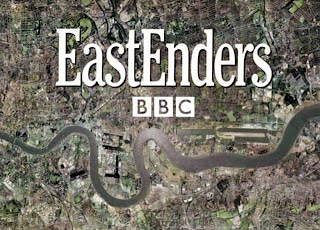 The Eastenders logo was great inspiration for our logo as it represents the brand image that we wished to create. It connotates a gritty, realistic, down to earth image due to the dull colours, choice of font and the location that the logo is of.
The logo for our production is a photograph of a local area, Shear Brow, which clearly displays the location our soap opera, takes place. The image has a slight grayscale effect, which enables it to look gritty and dark, connotating the gangster, sly, hard hitting, realistic feel to it, therefore contributing to the creation of the brand image. The photograph includes a newly built bridge in the area called ‘ challenge way' which is what gave us our soap operas name. We included this name onto our logo design in a font we selected for being bold, eye catching and complementing our image. We feel that eventually, it will be the font that will become recognised as the logo that people will associate the soap opera with.

Our Logo which was inspired by the Eastenders logo.
Throughout all our products, we were successful in maintaining our brand image. The success of our brand image came from focusing on three things; having a consistent font and colour for our logo which has the right connotations for our brand, a consistent brand image with the image of a gritty, real life, exciting soap and finally, a consistent theme and campaign of the love triangle storyline. The production of our TV trailer was clear in the brand image we were trying to create, due to various elements; the colours we used in editing, for example the black and white effect we included to give our trailer a gritty, gangster, hard hitting look and feel, reassuring our audience of our brand image. The way the characters performed in the production, the facial expressions, body language, costumes etc, the colours we chose for our poster ancillary task, black background to connotate the characters and the storyline, being secretive and in some respects dangerous, the red font we incorporated with the white font to add detail and emphasis on certain, important words. The way in which I edited the photographs of the characters, by desaturating them so that they related well with the colours of the actual poster and finally the logo of the BBC, our chosen institution, to enable the audience to be aware of which programme our product was created for along with our own ‘challenge way’ logo which clearly works well with the poster to achieve success in our brand image aim. For the other ancillary task of the TV listings magazine, I had to work extra hard in making sure that the bright, cheesy, traditional colours of the TV choice magazine and the eye-catching layout, did not result in our brand image being confusing for our audience. For this reason, I made sure that the storyline was clear by positioning the characters in suitable places so that hopefully the audience would understand the type of soap it is. The characters costumes are the same on the magazine as they are on the poster and in the TV trailer, which will hopefully allow the audience to recognise this and therefore keep our brand image clear in the form of an advertising campaign for all our products.
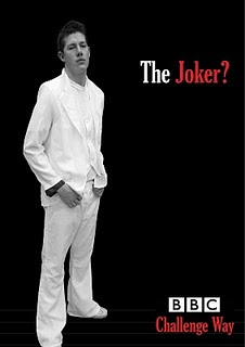
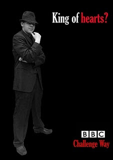

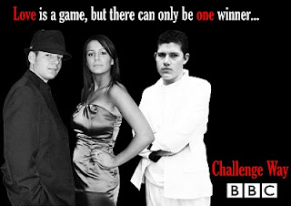
All the promotional posters for our soap, push and promote the brand image, following a gangster theme. This is made clear through the choice of colours, and the characters costumes. It is clear from the posters, that our film pushes a gritty, hard-hitting, sly brand image that we aimed to create and because of this, I feel confident that the audience will become familiar with the branding of our soap and be able to recognise and assosiate our logo, posters and insitution with 'Challenge Way', repetition and recognition leads to expectation and anticipation”(G.Burton, 2000)
We created our product based on inspiration from Eastenders, which is a very popular soap on BBC1. For this reason we created our TV trailer for the BBC institution. The BBC might distribute our media product, as we created a brand image for our soap that would most fit into the BBC institution well with it being of the BBC’s audiences expectations. The BBC is the perfect institution for our media product, as most programmes that the BBC distributes are dramas or programmes including soap operas e.g. Eastenders, that deal with controversial, realistic and topical issues. We considered ITV to distribute our production, mainly due to the inspirational TV trailer for Emmerdale which involves a format similar to ours. However after considering the brand image of our soap we decided it would be more likely to fit the BBC’s image and reputation.

We also used the conventions of the ganster film genre to add to the brand image. The storyline being the love triangle and the characters in the storyline which include a gangster and his girlfriend, the mise en scene of the characters costumes, the black and white suits for example which push the character and what types of people this allows them to resemble. Also the black and white editing which creates a dark, mysterious, secretive feel to the trailer, all of which relates to the gangsters character and what people assosiate this type of character with. The gangster theme which we created in our trailer adds to the the brand image of our soap in that it is realistic, gritty and hard-hitting which is all pushed through the inpiration of the 'gangster film' genre. This particular genre enabled our soap to be a hybrid, in that it includes more than one genre. This allowed us to offer something new to our audience. The inspiration for the gangster genre in our soap, came from the poker scene in lock, stock and two smoking barrels which includes a gangster character. This inspired us to not only consider the typical trailer genre and its conventions, or a trailer for a film, but also a specific theme in a film which allowed us in our final trailer to show hybridiity and push our brand image.
Question Three- Audience.
We needed our product to have an audience for our institution to target so we could construct our product to appeal to our particular chosen target audience. Our product, using the demographic profiling of GRASS is for females of any race aged between 16 and 35 years. The socio-economic status is groups C1 and C2, lower middle class and skilled working class. We chose females, as the plot of the our soap is a love triangle and so relating this to the Abercrombie (1996:51) quote, “the soap world is a woman's world; dominated by the domestic scenes, the emotions and feelings of strong female characters with a strong sympathy for these feelings and problems. Men, it seems, are excluded from watching these programmes by their very nature,” we decided that our product would be more successful in being aimed at our specified target audience of women. Any race would enjoy our product as people of any race or culture could relate to the issue or situation we chose to deal with in our trailer. We targeted our soap at women of ages between 16 and 35 as it is a fairly close age range that would be most likely to watch the type of soap that we have created, the brand image of real life, controversial issues which women in our chosen age range could most likely relate too. Our socio-economic status group was decided on due to the brand image of the soap and the types of stereotypical characters that would be included. Lower middle class and skilled working class people would perhaps be able to relate to our soap more than perhaps A OR B which are the upper and middle class. We also focused on a wider, secondary target audience to appeal to a wider audience, using again the GRASS demographic profiling system. Our media product was also trying to attract both genders because the plot of the trailer would attract males and females, e.g., the love triangle for females and the gangster theme for the males. Again, the soap is not aimed at any race as the situation could relate to anyone of any race. The main age range for our trailer, is 16-35, however we are not aiming to limit our soap to this age range, the older generation would also appreciate it because they most probably grew up with gangster films like the Godfather so the gangster theme in the trailer would appeal to them also. By using Maslow’s hierarchy of needs I am able to show the basic human needs our text fulfills and therefore why it appeals to our audience. On the scale, our product represents love and belonging and is why our target audience would be interested in it. The reason our trailer represents love and belonging, is because the plot is a love triangle with a good, innocent character and a gangster figure so the audience will want to watch the soap to see what happens and hopefully the woman will fall for the good character. Blumer and Mcquails theory of uses and gratifications also shows what basic human needs our media text is going to fulfill.
We attracted our audience using the ‘uses and gratifications theory.’ This theory counters the views that audiences are easily brainwashed, but actively consume the media to gratify their needs; people are capable of making their own minds up, accept some media messages, reject others and use the media for a variety of reasons at different times. Our trailer represents a storyline that many people often see in the media, particularly in soaps, which audiences can usually relate to and accept in society today. Blumler, McQuail and Brown have identified four major categories of which the media serve to gratify. Our trailer focuses on the Personal Relationships category, which is media texts that look at companionship via personalities and characters. The storyline that our trailer focuses on enables our audience to feel a sense of relationship between themselves and the characters. For example, women may feel themselves being in the same situation as the woman character in our trailer, being stuck between two men. Our trailer allows them to feel a connection with the character and help with their own situation.When advertising and marketing the product to our audience, I used AIDA, an acronym used in marketing that describes a common list of events that are very often undergone when a person or company is selling a product or service. We attracted attention to our product mainly through the creation of the ancillary tasks. The posters which we created for bus stops and billboards are mass promotional materials that allow the audience to be aware of the soap and using the colours, photographs and choice of slogan together with the selected font, attract the audience to watch the soap. The interest of our product was created through the different design that our posters offered. The black, white and red choices of colour gripped the interest of the audience as it is something they are not used to seeing and therefore made them focus on what the poster was promoting. We created the desire for our soap by focusing on a real life situation that is present in society today. The storyline that was created and then pushed, created a service that would satisfy our audiences need to see what happens in this type of situation and also the satisfaction that people in society who are experiencing what our product is pushing, would feel when having their problem dealt with in a media text. The action we wished for our audience to take, was to watch the soap, which we promoted well with the creation on our ancillary tasks, posters, magazine front cover and main production, the TV trailer all lead the audience to be interested in our product and pushed them to watch the soap.
Before deciding on our target audience, we carried out audience research to see which gender most watches soaps, what age range is most popular, which channel is most popular, whether or not audiences watch TV adverts, whether they are influenced to watch the soaps by the adverts and what type of storyline they most prefer. From our audience feedback, we found that the most popular aged range was between 25 and 40 and the most popular soap was Eastenders which is the soap that was inspiration for our product. I created numerous charts in Microsoft Excel to enable me to clearly see the results easily and therefore allow me to decide which audience range would be best for our soap to target.
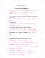
Once we had completed our actual product, we showed it to 15 people as part of audience testing and gathered feedback of our media product to see which parts worked well and elements of the trailer which we could have improved on. Numerous people said that it was very typical of a soap trailer due to the build up of enigmas, which was something we aimed for. They also stated that the characters were clearly represented and the stereotypical representations worked well together with the theme of the trailer. Some elements that people suggested could be improved on were the pacing of the trailer with some parts being made faster than others and also less black and white shots, to establish the colour of the characters costumes which could be used as a way or representing the characters. E.g the black suit for the gangster to connotate his dark, mysterious, sly character and the white suit for the love interest to show his innocent, culnerbale character. Reflecting back on this feedback, I would take into consideration what elements our audience has suggested we change. I would maybe take out some of the black and white shots as although they go with the posters to form a campaign, there are more black and white shots than coloured ones, which takes out the representation of the characters with the audience being unaware of detailed elements such as the colour of the suits to separate the gangster from the innocent guy. I would also speed up some of the relevant shots to give the trailer more detail and make some actions of the characters look more realistic. Other than these minor things, our audience feedback was good with numerous people stating that it followed all the typical conventions of a TV trailer and created enigmas which was what we initially aimed to achieve and that they would not improve anything. I would only make slight changes to our product to make it better.

Question four-Use of creative technologies
Throughout the entire project and production of our TV trailer, I used a number of media technologies to ensure that everything was created to the best that it could be. To begin with, we created a blog that would hold all our research, development stages and final products on blogger. This was a very simple and easy website to use and once we had set up our actual blog, blogging posts throughout the project was straightforward. There were many advantages of using blogger for example, I could go back and edit posts whenever I felt relevant, I could add videos, images and web links to the posts and it was also very easy and convenient to view particular posts without scrolling through the entire blog. However I also experienced some disadvantages that blogger created, for example on occasions, uploading images took a long time which slowed down all the other posting I had to do. There was also the problem of not being able to rearrange posts in an order we felt appropriate which was some times difficult if we had forgotten a certain post etc. The next part of my coursework involved me carrying out lots of research and so for this, I primarily used the internet. This software was very reliable and I managed to find all the relevant information that I needed through the search engine Google. I used Google to look at soap opera websites to decide on our institution and how we would create a relevant brand image to co inside with our soap. Another important source that I use a lot throughout the research and development stages of production was YouTube. I used this website, to research the format of TV trailers that already exists to see what elements we needed to include in our own trailer. The advantages of this website, was that it enabled me to view TV trailers from any channel, time period or programme at my convenience. It was very easy to look at existing trailers all in the same place without having to research hundreds of different websites. Another advantage was the easiness of importing the videos to blogger by just selecting and copying the embedded link into the relevant posts. These websites were very easy to look at and find all the information I needed. The advantage of using the internet for researching information was that it was always available whenever I needed to use it. It was a very convenient source to use and also reliable as it did contain all the information that I needed in order to carry out all the research needed to ensure our project was a success. I would not say that I experienced any disadvantages of using the internet and I would definitely use the internet again to gather information. Once I had gathered all the information and research needed, it was then production time and in creating our actual TV trailer, we used lots of physical technology. The DV (digital video) cameras were our main source for filming our trailer. These cameras had many advantages such as having the ability to be hand held to create hand held shots, panning shots and quick pan shots. This was particularly good as our trailer included all these shots. Another, that it could be placed on a tripod for the shots that needed to be still and steady such as the close up shots and the high and low angle shots of the characters. However the camera did also have some disadvantages, for example on some of the high angled shots, although the camera was on a tripod, it was difficult to capture some still shots without the camera shaking a little. Apart from this disadvantage, the DV camera was very easy to use and was of a good quality.
 We also used digital stills cameras, to take photographs of the characters for our posters and magazine front cover and the props we used as part of the planning stage. We used these stills to also take photographs of our props in the research and development stage of the production. Advantages of the digital cameras were that they were very straightforward and uncomplicated to manage and were convenient and quick to use, also that you could view the photographs once taken on the screen at the back of the camera, which allowed us to see if the images were decent or not. However I also came across some disadvantages of using the digital stills cameras, for example some of the photographs were shadowed or reflected light from the lighting and so we had to adjust lighting to get a good photo which at times was rather inconvenient. It was also a disadvantage that some of the images were blurry due to the instability we had when capturing the photo.
 Once we had shot our trailer, the biggest part of the final production, was to advance edit the footage in software called Final Cut Express which is a non linear video editing application created by Apple. We firstly did a rough cut which involved us getting rid of the all the footage that we were certain we did not want using the erase tool. Once we had done this, we then made sure all the shots were in the right order so that the trailer obviously made sense. Once all the important elements were complete, the cutting and rearranging of shots, we then edited the trailer as a whole by adding transitions so that the changing of shots to shots was done smoothly and looked professional. We also used the colour grading tool on the colour corrector video filters menu, to give the main footage a professional and typical look of a TV trailer. We toned down the hue and saturation so that the yellow tones were reduced. We also changed the brightness and contrast of the black and white shots to add to the dark, gangster look and feel of the trailer. We also added a track which we found on the creative commons website, called house of the rising sun by Nostalja. The advantages of using this software were that it is a package that professionals use and so it gave us the advantage to give our footage a professional look and was also straight forward to use. The disadvantages of Final Cut Express are that it took time to get used to everything which at first took time, there was lots of different parts that I needed to become familiar with as there are many components that are involved in editing a good piece of footage. Another problem with this software, which gave our final trailer a disadvantage, which some members of our audience picked up on looking at the feedback, was the fault in uploading our soundtrack. Firstly the soundtrack was fine and was of good quality, but when showing our final trailer to the audience, we noticed that the soundtrack was jumping slightly, which we had no control over and put down to the software. This was the only problem that we faced with Final Cut. When creating our ancillary tasks, I used two of the main adobe software’s, Photoshop and InDesign. I used Photoshop to edit the primary photographs of the characters, by cutting them out of the background using the pen tool, which allowed me to draw around the outline of the character and then cut them from the background. I then desaturated the images for the posters as we wanted them to be black and white as part of the campaign, editing the brightness and contrast too to make them look more defined but was careful not to erase the detail. I also reduced the hue and saturation of the coloured photographs that were used on the magazine front cover, as they had yellow tones which made them look unprofessional. There were many advantages of Photoshop, for example, it was a very easy software to manage with the simple icons easy to access and the pen tool allowed very close cuts of the characters, which left our images perfect for arranging on the magazine front cover and the posters. One disadvantage of Photoshop that I discovered once I had placed the edited photographs onto the IN Design document was that Photoshop had left a discoloured box around the images, despite me having removed all the background from the images. This was a technical problem with Photoshop which could not be resolved personally. Other than this slight disadvantage, Photoshop played a big part in the success of the ancillary tasks and I would definitely use this software in further productions. The other adobe software that I used to create the posters and magazine cover was In Design. It gave me the advantage to lay out the magazine in particular, in a conventional way due to the marks and bleed lines that it offered me, to ensure that everything was professionally inline and positioned correctly. I placed the photographs which I had previously edited in Photoshop and then saved, onto the page and then using the shift key, was able to re-size the images to fit, without them being cropped of loosing detail. I did not experience any disadvantages of this software in the creation of the magazine, however, I did have problems when creating the posters with the black background, due the transition between the Photoshop edit and the placing in InDesign. Overall, the uses of technologies have allowed us as a group and also myself individually, to create a media product to the best of our ability. The internet played a huge role in the research and development of the product due to me being able to look existing trailers, present all of the development, download music, and download images for the magazine. Without the availability of technology in our production, I would have been unable to edit the trailer and in some respects even create it to a high, professional standard and the ancillary tasks would have not looked conventional or been successful products from any of the media technologies, as they all allowed me to do all the elements that wanted them to as part of the brand image campaign. I did not experience any limitations to the creation of the. I would definitely use all the technologies again if I was to re-create the trailer and ancillary tasks.
Overall, reflecting back on the project as a whole, I feel that one particular element we achieved was the success in creating a brand image. We focused fully on the type of brand image we wished for our products to push, the dark,girtty, hard-hitting look and feel to our soap, which related well to the storyline of our soap and trailer and also the ancillary tasks.We then throughout the whole production, aimed to focus on pushing this brand image onto our audience in every aspect of our products. The logo which I feel is particulaly important when expecting our audience to relate to it as our soap 'Challenge Way' clearly connotates well, the genre and brand image of the overall soap. This allows our audience to feel a sense of familiarity with our soap and therefore enable them to successfully assosiate the logo, posters, magazine front cover and trailer with our soap opera and know it well!
I feel that I contributed to this project 100% and inputed everything to the best of my ability. My strongest points lied in the production of the anciallry tasks which I put most of my time and effort into. I managed my time well and made sure that I was clear of what I needed to do in order for the posters and magazine to be successful.


 We also used digital stills cameras, to take photographs of the characters for our posters and magazine front cover and the props we used as part of the planning stage. We used these stills to also take photographs of our props in the research and development stage of the production. Advantages of the digital cameras were that they were very straightforward and uncomplicated to manage and were convenient and quick to use, also that you could view the photographs once taken on the screen at the back of the camera, which allowed us to see if the images were decent or not. However I also came across some disadvantages of using the digital stills cameras, for example some of the photographs were shadowed or reflected light from the lighting and so we had to adjust lighting to get a good photo which at times was rather inconvenient. It was also a disadvantage that some of the images were blurry due to the instability we had when capturing the photo.


 Once we had shot our trailer, the biggest part of the final production, was to advance edit the footage in software called Final Cut Express which is a non linear video editing application created by Apple. We firstly did a rough cut which involved us getting rid of the all the footage that we were certain we did not want using the erase tool. Once we had done this, we then made sure all the shots were in the right order so that the trailer obviously made sense. Once all the important elements were complete, the cutting and rearranging of shots, we then edited the trailer as a whole by adding transitions so that the changing of shots to shots was done smoothly and looked professional. We also used the colour grading tool on the colour corrector video filters menu, to give the main footage a professional and typical look of a TV trailer. We toned down the hue and saturation so that the yellow tones were reduced. We also changed the brightness and contrast of the black and white shots to add to the dark, gangster look and feel of the trailer. We also added a track which we found on the creative commons website, called house of the rising sun by Nostalja. The advantages of using this software were that it is a package that professionals use and so it gave us the advantage to give our footage a professional look and was also straight forward to use. The disadvantages of Final Cut Express are that it took time to get used to everything which at first took time, there was lots of different parts that I needed to become familiar with as there are many components that are involved in editing a good piece of footage. Another problem with this software, which gave our final trailer a disadvantage, which some members of our audience picked up on looking at the feedback, was the fault in uploading our soundtrack. Firstly the soundtrack was fine and was of good quality, but when showing our final trailer to the audience, we noticed that the soundtrack was jumping slightly, which we had no control over and put down to the software. This was the only problem that we faced with Final Cut. When creating our ancillary tasks, I used two of the main adobe software’s, Photoshop and InDesign. I used Photoshop to edit the primary photographs of the characters, by cutting them out of the background using the pen tool, which allowed me to draw around the outline of the character and then cut them from the background. I then desaturated the images for the posters as we wanted them to be black and white as part of the campaign, editing the brightness and contrast too to make them look more defined but was careful not to erase the detail. I also reduced the hue and saturation of the coloured photographs that were used on the magazine front cover, as they had yellow tones which made them look unprofessional. There were many advantages of Photoshop, for example, it was a very easy software to manage with the simple icons easy to access and the pen tool allowed very close cuts of the characters, which left our images perfect for arranging on the magazine front cover and the posters. One disadvantage of Photoshop that I discovered once I had placed the edited photographs onto the IN Design document was that Photoshop had left a discoloured box around the images, despite me having removed all the background from the images. This was a technical problem with Photoshop which could not be resolved personally. Other than this slight disadvantage, Photoshop played a big part in the success of the ancillary tasks and I would definitely use this software in further productions. The other adobe software that I used to create the posters and magazine cover was In Design. It gave me the advantage to lay out the magazine in particular, in a conventional way due to the marks and bleed lines that it offered me, to ensure that everything was professionally inline and positioned correctly. I placed the photographs which I had previously edited in Photoshop and then saved, onto the page and then using the shift key, was able to re-size the images to fit, without them being cropped of loosing detail. I did not experience any disadvantages of this software in the creation of the magazine, however, I did have problems when creating the posters with the black background, due the transition between the Photoshop edit and the placing in InDesign. Overall, the uses of technologies have allowed us as a group and also myself individually, to create a media product to the best of our ability. The internet played a huge role in the research and development of the product due to me being able to look existing trailers, present all of the development, download music, and download images for the magazine. Without the availability of technology in our production, I would have been unable to edit the trailer and in some respects even create it to a high, professional standard and the ancillary tasks would have not looked conventional or been successful products from any of the media technologies, as they all allowed me to do all the elements that wanted them to as part of the brand image campaign. I did not experience any limitations to the creation of the. I would definitely use all the technologies again if I was to re-create the trailer and ancillary tasks.