Once we had done all our research, we planned what our designs were to look like by drawing rough sketches of the posters and magazine front cover. This helped us to choose the perfect layout, positioning of the characters on the page and the colours we had selected for the font.
Showing posts with label Hannah. Show all posts
Showing posts with label Hannah. Show all posts
Friday, 29 January 2010
Planning


Monday, 18 January 2010
Progress
This past week we began to make a rough cut of our film. We first got rid of all the footage that we did not need and then we began to put the video footage in the order according to our earlier storyboard and we hope that by the end of this week the rough cut of our trailer will be complete. While we have been editing our film we have also made a start in making the first of our ancillary task,the four posters. The idea behind them, is to have three posters of the characters, individual on thier own and then a billboard poster of all the characters together. Towards the end of this week we will be creating our next ancillary task, the magazine cover, as well as continuing with the editing of our video.
James
19/01/10
We have finished our first ancillary task which consists of the billboard poster (shot of all three characters) and the individual posters. I first began to create the billboard poster in InDesign, where I created a black back ground and placed the individual images of the characters onto the page, having cut them out of their original backgrounds on Photoshop. However, after printing them, I noticed a black box around the images which did not intergrate with the black background. Due to this, we had to transfer our final design to photoshop and then further we had to create all our other posters in Photoshop straight away without the use of InDesign at all. We desaturated all our images to keep the consistency and flow of the campaign and kept our colour palette to 3 colours, black,white and red for effect. We used the same font as we did for our "Challenge Way" logo, Gloucester MT to keep a coherent feel to our production.
Hannah
25.1.10
We have almost finished our second anciallry task which is to create the front cover of a TV listings or soap magazine. We chose to create our front cover of a soap magazine purely through the inspiration of TV Choice magazine which is a very popular and well recongised soap opera magazine. We have used the close up images of ourselves which we took on the same day we filmed our production, as these are more likely to be on the front cover of a magazine to attract the readers attention. We created the front cover in InDesign as it allows us to layout the various elements of the magazine correctly and proffesionally. We edited all our images in photoshop as some of them needed their hue and saturation reducing.
Hannah
26.1.10
We have almost completed both our magzine cover ancillary task and editing our video we have decided to make some final changes to our video.We had to erase some small problems with our video on was that the first scene was turning black and white at the end which we did not want so we did it again so now only the scene after it is black and white.We have also fixed a scene in which robs character is flicking a chip but the scene restarted at the end so Rob deleted the end of the scene to get rid of the problem.
James
26.1.10
We have finally completed our magazine ancillary task. I feel that the final outcome looks really good and traditionally like other soap magazines that are already available to buy on the shelves today, which was what we were trying to achieve. The image we were trying to create for our magazine, was cheesy, bold and bright,stereotypical and not look like a high end, classy magazine with the contrasting colours and the corny vector shapes. Before creating our magazine, we primarily created it with a particular target audience in mind. Looking at our final outcome, we feel successful in our target audience, aiming it at middle aged women.
02.02.10
Today we have decided to upload our video on youtube in order to gain further feedback from a much broader audience hopefully drawing in a response from our target audience. The final edit has been colour graded so that we have achieved our film look that the majority of soap advertisements have. The image is much darker than the original filming and hence the atmosphere is more like a real life poker game. I have also edited the music choice so that the instrumental part emphasizing the electric guitar is involved making the final product more powerful. I have also added more of defragmentation effect so that the black and white scenes make the scene more classic and stylish. As a group we decided to remove the logo from the final cut as it was too bright and friendly and the advertisement does not support this concept. Instead I opted to use the same text as the poster over a black screen that fits in with the whole darkness of the video. I also decided to put in some cross cutting (the cut of James and myself/ James and Hannah) so that the audience can feel like there is some intensity between the characters. To conclude this post I feel that the editing process was extremely lengthy but the final cut has delivered the image that we were aiming for.
Rob
Wednesday, 13 January 2010
Editing
Once we had gathered all our footage, we needed to delete parts that we didn't need or want in our final production. We began with rough cutting which entailed getting rid of certain scenes or the shots that we definatley didnt want, to leave us with essential and potential shots. This also had the advantage of reducing our filming time as our brief is limited to 90seconds and our filming was almost 20minutes worth. When looking through our filming, it was easy to distinguish the parts we needed to create the perfect poker scene, for example, close up shots of our props which we evaluated we could speed up for perfect effect and a technique that also reduces the time. Once we have eliminated all the footage we don't want, we are going to manipulate the shots by adding effects, changing the brightness and contrast of some of the shots to create a more relevant feel to the scene, for example bright shots that are to look much more dark and gritty and edit the shots by making them faster or slowing them down for effect. Having become more familiar with this editing package and experimented with the different styles of editing our filming, we came across the re-winding effect, which we discovered is perfect for the close up shots of the cards and chips being flicked, so we also included this effect into our final production.
Monday, 11 January 2010
Production
The production of our soap trailer, went really well. The use of props, location and lighting in particular, worked brilliantly together to create a realistic and appropriate feel to the image of our trailer. We took numerous different shots, high angled, low angled, canted, close ups etc so that when we come to edit our filming, we had various shots that we could work with and then decide which ones work best for our final production. Some shots unfortunately didn't work as well as we expected them too, for example the high angled shot of the cards, as the shadow of the camera reflected on the green felt and looked unprofessional. However, most of the filming we did worked out perfect and better than we expected, for example the light reflecting off the love interests white suit, made the suit look like a bright light which is perfect for representing his character as being innocent and vulnerable.


Thursday, 10 December 2009
Ancillary Task-Poster
For our ancillary tasks, we have chosen to create the front cover of a TV listings magazine and a range of promotional material to promote our soap and our trailer. We are going to create a number of posters, including billboard posters and one for bus stops. All these promotional materials will enable us to create our brand image along with promoting our soap and trailer.
We have researched a number of soap posters that are possible inspirations for our own production. Below, is a poster for ITV's Moving Wallpaper and Echo Beach, which were created by ITV to promote the programme. The poster is good inspiration for our task as it has simple shots that easily convey what the programme is about. The use of the puppet string, shows that the writers of Moving wallpaper are controlling Echo Beach, the use of props, facial expression and body language connotate the programme content and what the soap is about.

Below is another poster for an ITV programme, this time a drama and the genre is clearly show in the image. The use of the action still shot, creates a sense of realism and allows the audience to feel 'in the moment.' The poster promotes the programme well and people who are not familiar with The Bill, will be aware of the genre and what to expect of the programme. We are aiming to do the same, by creating posters that will enable the audience to fully understand what our soap is about and clearly understand representations of the characters.

Tuesday, 8 December 2009
Logo (Brand Image)

Above is our soaps logo which was inspired by the Eastenders logo. We decided on this design as it clearly shows location of our soap just as the Eastenders one does. The image was shot at the top of Shear Brow, Blackburn by Rob and James. It is an extreme long shot from a slightly high angle as it was shot at the top of a hill, this shows clear location and consists of a wide range of areas in the location. The image has a slight greyscale effect, which enable it to look gritty and dark, connotating the gangster, sly, hard hitting, realistic feel to it, therefore contributing to the creation of the brand image of the soap. The font that we chose, was selected for being bold, eye catching and complimenting our image effectively. We feel that eventually, it will be the font that will become recognised as the logo that people will associate the soap with.
Friday, 4 December 2009
Planning
PROPS LIST
Poker set (chips and cards)
Green Felt
Ring
Dress
Shoes
Black Suit
White Suit
Whiskey
Whiskey Glass
Hat
Large, round table


CAST LIST
Gangster- Rob Maclean
Female Protagonist- Hannah Gilrane
Love Interest- James Laraway
LOCATIONS
Hawarth Art Gallery- Potential door shot
St Mary's College performance theatre- Majority of all the shoot

This shot is of the performance theatre at our college, St Mary's which is the location for our shoot. We originally wanted to shoot our trailer in a location outside of college to give us a more realistic, experimental approach to the shoot. However, visiting the theatre, it was clear it was a perfect location to film our trailer. The room is dark with the black curtains around the room and the only light available, is the spot lights above the room, which are just right for creating the gangster feel to our poker scene. On shooting our trailer, we are going to have one main spotlight on the table and the characters to create the perfect atmosphere.
Call Sheet

Health and Safety Form


Thursday, 12 November 2009
Genre
TV trailers are created to promote a particular storyline that is coming up in the soap. They usually concentrate on one particular character which focuses on the characters role in the leading storyline.
Below is a TV trailer for Coronation Street where it focuses on Tony Gordon,the local business man, who has two sides to his character. This is all shown and promoted in this trailer.It is clever as it establishes the genre of the soap well as Tony is considered a caring, kind and thoughtful character on the street, something which audiences usually associate with the genre of Coronation Street. The trailer also includes a slogan which is a pun on the soaps trailer content and the soaps narrative. It relates well to the soap and allows consistency within the branding element of a soap. It goes against what the audience expect from this particular soap, however special storylines are created to entice the audience and give them something interesting and something almost unexpected of the soap, this draws in the viewers as they are not something that happens in every episode unlike social issues and realistic storylines.
Below is a TV trailer for Emmerdale which does not follow the conventions of the soap but is more like a film trailer, something that is typical for promoting a main story line coming up in the programme. It does not show one typical geographical location, it is instead mainly set in a luxurious bathroom something that is not a typical location in any soaps as it does not create a sense of realism. The costume of Charity excluding the end of the trailer is not typically something an audience would see a soap opera character wearing and there is no particular social issue present in the trailer.
Our soap is not really a hybrid but could be argued that it has a 'gangster' genre with the protagonist and the main storyline which our trailer will
TV soaps do follow the main conventions of the genre with main characters and stereotypes, the soaps distinctive mise-en-scene and typical ideologies. However in soap promos all of these are broken and there is no evidence of soap conventions.
For example typical conventions of a soap is
-the iconic theme tune and establishing shot,(shown below, the Eastenders opening)
-a close geographical location
-a core cast of familiar characters that the audience recogise and form personal relationships with.
-Stereotypes
-Multi-stranded narratives
-Cliff Hangers
-Time-the past is acknowledged and there is a sense of future
-Communal meeting places (pubs,cafes etc)
-Realism of costumes and set
-Important social issues are addressed, Crime, pregnancy, adultery, rape etc...
All of these conventions are present in most soaps with few breaking the conventions.
According to Brown (1997) soap operas are primarily aimed at a female audience even though many males enjoy watching them.
Christine Geraghty (1991) suggests that there are four elements which explain the appeal of soap operas...
-an emphasis on a central woman whom the audience is invited to support,
-a division between the public and private sphere with woman controlling the public space.
-an emphasis on building and maintaining relationships.
-an element of fantasy in which things such as love and relationships are given priority.
There are two genres that our main project is going to follow, the soap opera genre and the soap trailer genre . However our trailer will not follow the conventions of a typical soap but follow a similar format to film trailers. They often break the realism which soaps are normally confined.
Tuesday, 10 November 2009
Insitution and Branding
Branding is a very important part of promoting a particular product, is helps to enable a reputation and a relationship between the brand name and the actual product.
"Competitive branding became a necessity of the machine age-within a context of manufactured sameness, image-based difference had to be manufactured along with the product" Naomi Klein,No logo.
For this reason, branding is very important to our industry. The design of our logo, the genre and choice of institution, all need to be a brand of our soap and trailer. It is important to have a familiar, recognisable image that the audience can associate the product with time and time again. It creates a sense of relation between the audience and the product. The use of logos, slogans, and choice of institution all create a brand image for a product which, "provides customers with a consistent, compelling experience in order not to confuse them as confusion can lead to doubt." mudvalley.com
However a brand is not the same as our product, for example a TV soap is a product but Eastenders, Coronation Street and Emmerdale are all different makes of a soap.
All british soaps that we had researched have a brand image that easily allows the audience to associate a particular logo for example with a particular soap.
Our brand image, is similar to Eastenders with the dark, gritty, realistic feel to it. Our Tv trailer, logo and advertisement posters will all promote and push this brand image. The idea of being sly and gangster like will be pushed in our trailer with the portrayed image of our main protagonists.
Below is a number of brand logo's for different british soaps. It is clear that the image of the logo allows people to automatically link it to a specific soap or by watching the first few seconds of the opening sequence, the audience is clear as to what soap they are watching, just by the logo, and music being played.

Just looking at the logo for Coronation Street it is clear what the soap is about. It connotates family life, an old working class society, northern, friendly, old fashioned, war-time spirit feel to it and in some respects uncontroversial compared to other soaps such as Eastenders and hollyoaks. It is aimed at an older audience and just from the colours, and the mise en scene from the logo such as the old fashioned milk float make it clear what Coronation Street is about.
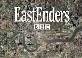
The Eastenders logo is very simple with a birds eye view of the East End of London. Although there is nothing much to this logo it is very clear of this soaps location-East London. This connoates city life, urban, controversy, working class, crime. The colours on the logo are grey and dreary which relate well to the location and weather of London.
This soap trailer for Eastenders helps to create the brand image. At the end of the trailer a brand slogan is used which helps to create the identity of the programme. The slogan "there's more to Eastenders" relates well to the brand image by creating a sense of grittiness and secrecy.

The Emmerdale logo clearly initiates the soap with being set in a small village in the countryside with the greenery ,the village pub and the land rover. It is not really controversial and more a more local feel where everyone knows everyone elses business.
The name 'soap opera' first coined in the 1930's in the USA. It was used to describe radio series that were sponsored by the manufacturers of soap powder;hence "soap." The opera part came from the fact that they were about dilemmas, or other dramatic/melodramatic situations. By the 1950's, these serials had made the transition to the TV. They spread across the world and grew in popularity. ITV's soap Coronation Street, is the longest running soap in the world.
We researched Soap Opera viewing figures to see which Institutional Soap was watched most, at the beginning of the week (monday) 15th November 2009. Below is a comparison of several soap viewing figures which helped us to establish which was most popular by the viewing public. These figures, were found on, http://www.barb.co.uk/report/weeklyTopProgrammesOverview?
BBC 1- Eastenders 9.5 million
ITV 1- Coronation Street 10.7 million
ITV 1- Emmerdale 7.51 million
Channel 4- Hollyoaks 1.80 million
Channel 5- Neighbours 1.67 million
Channel 5- Home & Away 1.25 million
Evaluating these figures, it is clear that Coronation Street was the most popular viewed soap on this particular night, having over 10 million viewings. Eastenders was the second most popular viewed soap.
Although ITV1's Coronation Street was the most highly viewed soap and could therefore suggest it is most popular, we have decided to create our Soap and TV trailer for the BBC institution as it is most like Eastenders with the gritty, realistic, dark feel to it.
Introduction
Hello and welcome to our blog!
Our group consists of Hannah, Rob and James and we have chosen to produce a TV/Soap promotion.
We are intended to create a promotion package for a new soap opera which is to include:
-a TV trailer
with two of the following...
-a listing magazine
-two hyperlinked websites (with a video extract) for the soaps website
-a poster for the soap
We have chosen to create the listings magazine and the poster to promote the soap.
Subscribe to:
Posts (Atom)